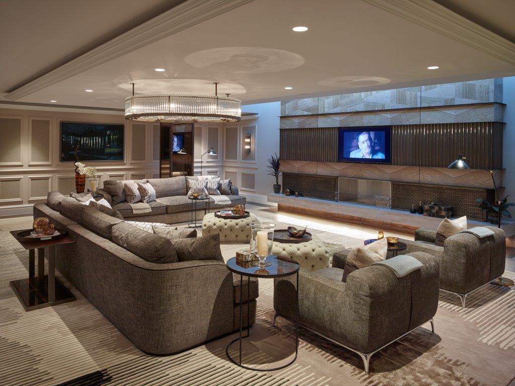
Yes! Another website redesign, but why? Well, over the past couple of months we have received feedback on improvements and we started to have a think about whether the website was worth constantly updating, or should we try something new. The team looked into the number of issues the site had and decided to go for a redesign.
When we came to this decision, the first thing we thought about was whether to retain some of the original design or not. Although we were happy with the design, it didn’t really make our work stand out too well, so we thought “If we are going to redesign the site, let’s go all out and change everything!”, and so we did.
Our main objectives for the site were the following:
- Simplicity and minimalism
- Let our work do the talking
- Improve the overall user experience
Redesign Simplicity and Minimalism
One issue we had with our previous design was how much content we tried to put on a page, especially our home page!

There was a lot going on within the page, and didn’t really feel like it was helping users understand what we’re trying to deliver: what we do and let our work do the talking.
When we discussed our goals, we realised that we are doing too much and we should simply follow a well-known motto, “Less is More”.
The new site is now focused on keeping things simple. No more using up all of the white space, and not to fit too much in to a section on a given page.

Let Our Work Do The Talking
Although wanting simplicity and minimalism is all well and good, execution can be challenging. Usually when showing off a portfolio, imagery is enough for users to understand the message it is trying to deliver.
So back to the drawing board we went. We had a look at our gallery and realised that they send a clear message, so maybe we don’t need to do much to help them become more noticeable. Our previous design did allow for images to be a focus point, but there were areas that they were being cut off, or were clashing with other images, not allowing them to show off in all its glory.


Now we feel like we have done better and can showcase our work, without projects clashing with each other and not being cut off.


Improve The Overall User Experience
Two hurdles cleared, now for the big one! Making sure users can navigate around the site and clearly defined areas. One thing we noticed with the previous design was that the top of almost every page looked a bit of a mess and didn’t really explain well the page a user was on. We initially thought about giving pages as much colour as we thought, but to keep in line with our redesign goals, we decided to take a step back and provide a more simple intro section.

We are very proud of what we were able to accomplish with this, as we were really focused on keeping everything consistent for the site and for our users.

WE have also made refinements and additions throughout the site. Hopefully our users can find their way around with ease.
Conclusion
We had a lot to say for a website redesign! But we are proud of what we have done, and wanted to talk about it with our readers. We want to thank our users for providing feedback on our site and helped us with rebuilding it, we couldn’t do it without you!
Stay tuned, as we have more news to share with you! You can keep up to date on our website, Facebook, and Instagram.
Speak to you soon.
Alice
x

